 Here is my card for Beate's Sketch Challenge. I'm loving the new In Colors, so I used them again for this card. It's a 5 1/4 inch square card with Purely Pomegranate as the base. I stamped Fine Lace as a background in the same colour ink. I like the Certainly Celery and Apricot Appeal as complementary colours. I stamped the leaves from Wild Rose in Wild Wasabi ink all over the strip of celery CS. I stamped the rose in pomegranate ink on apricot CS (the solid image was stamped off once so it would be lighter). Then I cut it out and adhered some leaves to it. I adhered it to the card with dimensionals. The sentiment was stamped on celery designer paper from the Palette of Prints in pomegranate ink, then punched out with the round tab punch.

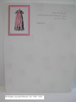
Saturday, June 30, 2007
Beate's Weekend Sketch Challenge #8
Here is my card for Beate's Sketch Challenge. I'm loving the new In Colors, so I used them again for this card. It's a 5 1/4 inch square card with Purely Pomegranate as the base. I stamped Fine Lace as a background in the same colour ink. I like the Certainly Celery and Apricot Appeal as complementary colours. I stamped the leaves from Wild Rose in Wild Wasabi ink all over the strip of celery CS. I stamped the rose in pomegranate ink on apricot CS (the solid image was stamped off once so it would be lighter). Then I cut it out and adhered some leaves to it. I adhered it to the card with dimensionals. The sentiment was stamped on celery designer paper from the Palette of Prints in pomegranate ink, then punched out with the round tab punch.
Friday, June 29, 2007
Flower Power!

I was quite ambitious yesterday! I wanted to try emboss resist again (my first try was two days ago - check it out here). It's the same basic layout as my first card, but I also wanted to challenge myself to have several layers and I wanted to use the Vases in Vogue stamp set. So here's what I ended up with.
First, I did the emboss resist piece. The flower I stamped on the embossed piece is from Pick a Petal but it goes with the flower from Vases in Vogue. I needed a solid-image stamp for emboss resist, so I used that one. It's stamped on Whisper White in VersaMark, then embossed with clear EP. I sponged Blue Bayou, Almost Amethyst and Barely Banana over the piece. I chose those colours because I wanted to use Blue Bayou and I had some Amethyst cards pre-cut already and they went together nicely. I thought Barely Banana was a nice light colour that also complemented the other two!
For the main flower image, I stamped the vase first in Basic Black, then stamped another on scrap paper and cut it out to use as a mask. I placed it over the first vase, then stamped the flower stem in Wild Wasabi (the stem went into the vase mask). This stem actually has a little flower on it, but I wanted a bigger one so I didn't ink the flower. Instead, I stamped the big flower from the Vases set in Blue Bayou on top of the stem. Then I coloured them in with blender pens. I'm practicing my watercolour technique - I tried to highlight the vase so it looked realistic, but I have a lot of practicing to do! After it was coloured, I sponged Almost Amethyst over the paper to soften it a bit. I matted this piece and the embossed piece with Blue Bayou.
I also wanted some ribbon on it, and navy grosgrain was the closest I had to matching any of the colours I had chosen! I can't wait until I can order the double-stitched ribbon in the In Colour colours. I found a tag from my tag sheets (it's Confetti White) and stamped the sentiment in Blue Bayou. Then I sponged Blue Bayou and Amethyst on the tag, edged the tag with Blue Bayou and tied it to the ribbon with silver cord.
Originally, I adhered everything to a plain Almost Amethyst card base, but it needed something else, so I dry embossed the card base using the Seeing Spots classy brass template. And there it is! Seven layers (if you count the ribbon)!
Thursday, June 28, 2007
July Stamp Club Cards
 These are the cards my Stamp Club will be making on Tuesday. I wanted to show them a few techniques as well as some of the new Stampin' Up! products, so I tried to combine everything! All of the tutorials are found on Splitcoast Stampers (I've included links to the specific techniques with each card).
This first card uses the Emboss Resist technique. I totally CASEd the card design from my upline, Sarah Hunter. I stamped the flower from All Through the Year in VersaMark all over a piece of Whisper White CS (tip: for a really cool effect, you can stamp on glossy white paper as well). Then I covered the images with clear embossing powder and heated the powder with a heat tool. After the images had cooled, I sponged Wild Wasabi and Groovy Guava ink over the entire piece of cardstock. Then I wiped the ink off of the flowers with some kleenex so they showed up better, and voila! To finish off the card, I tied Celery grosgrain ribbon around the embossed piece (I can't wait until we can order from the new catalogue - they have double-stitched ribbon in all the new In Color colours!), then mounted it onto Wild Wasabi CS. The card base is Groovy Guava. I stamped the sentiment from the Vases in Vogue set in Wild Wasabi ink.
 The next card is using the Polished Stone technique. I just love this technique - it's so easy and it looks so elegant! I used some different colours this time. (You can see the other card I made with this technique here.) For this card, I used Apricot Appeal, Bashful Blue and Certainly Celery re-inkers on glossy white paper. I soaked a cotton ball in rubbing alcohol and put a few drops of dye from the re-inkers on it. Then I sponged it all over the glossy paper. After the ink had dried, I stamped the image from Garden Silhouettes in black Staz-On ink. I mounted the paper on Basic Black CS, then tied black grosgrain around it. The tag is from a tag sheet, stamped in Basic Black ink with a sentiment from Vases in Vogue (actually, I didn't have Celery tag sheets, so I traced around one that was a different colour, cut it out and punched a hole in it using the 1/8 inch circle punch). I tied the tag onto the ribbon using gold cord. Then I adhered the whole thing to the Certainly Celery card base.
The final card we will be doing is a Triangle Tri-fold card. You can see one of my previous examples here. I love the new designer series paper that you can get in sixteen different colours! This card is made using Soft Sky. I like the monochromatic look, so I stayed with Soft Sky and Whisper White for this card. I used the Baroque Motifs stamp set for the stamped images. For the front part of the card, I stamped the circular design, then put a light blue rhinestone brad through the center (the brad is from the new Ice rhinestone brad package).
 Then I adhered it to the Soft Sky matte with dimensionals. It is all tied together with white organdy ribbon. The card base is made from Soft Sky CS.
Tuesday, June 26, 2007
Just a Little Something
First of all, I have a RAK I'd like to send to dd2njoy. Your comments are so encouraging to me. Please email me your mailing address so I can send you a little something! (By the way, my husband doesn't really think I'm crazy - he's totally supportive of my stamping habit! He just thinks it's funny that I can get so excited about decorating a paint can! LOL)
Second of all, MY NEW CATALOGUE IS HERE!!! My complimentary demonstrator copy of the new catalogue was sitting in my mailbox this morning! It is so beautiful (the cover is in Blue Bayou with Brocade print). Lots of great new stamp sets and accessories. I'm not so sad anymore about all the retiring stuff. It is laid out so much better than last year's as well - it's much easier to understand the accessories portion and there are lots more tips throughout. I've spent the past hour and a half looking through it! Maybe I should get some housework done... tomorrow! LOL!
 On to the stamping: I was playing around with the Pick a Petal set, and I came up with this. It's pretty simple. I stamped the small flower in Blue Bayou and then the polka dot petals in Soft Sky around the small flower (so the petal points are in the indents of the flower). Then I stamped the petal outlines in Blue Bayou. This was all stamped on Whisper White CS, then cut out. Then I stamped and cut out the small flower in Soft Sky and layered it over the center of the flower, attaching it with a rhinestone brad from the new Ice Rhinestone brads kit. The card itself is 4 x 4 Blue Bayou. I layered some Soft Sky designer series paper on the card, then adhered the flower to the whole thing with a dimensional. Some white grosgrain and a little "lovely" sentiment in Blue Bayou from the Garden Silhouettes set finished it off.
Monday, June 25, 2007
My First Sketch Challenge Card
 I've never tried a sketch challenge before since I don't have a lot of creative ability, but Beate's challenge looked like something I could probably do (she even said it was easy!). I had some glossy paper left over from my first attempt at polished stone technique (see below), so I thought that would make a nice background. I adhered that to my Pale Plum card base, then sponged Perfect Plum lightly around the outside. I put a strip of Perfect Plum across the bottom, then cut some strips of the polished stone paper and tapered that across. I used a metal edge tag for the circle embellishment. I stamped the flowered heart from Simply Said inside with Perfect Plum ink. I then covered the whole thing with VersaMark and embossed it with Iridescent Ice EP (it's hard to tell from the photo, but it's all sparkly and pretty!). Then I stamped the sentiment from Holidays & Wishes in Perfect Plum, then stamped over it again with VersaMark (I used a Stamp-a-ma-Jig to make sure I stamped directly on top). This was embossed with Iridescent Ice as well.
 This was my first attempt. I didn't like the Pale Plum rectangle with the sentiment, so I got rid of that and stamped right on the Perfect Plum strip and embossed it (as I said above!).
Anyway, I hope you like it!
Altered Paint Can
 I needed to make something to hold the door prize slips for my New Catalogue Open House, and I've been wanting to try an altered paint can for quite awhile, so I thought this was the perfect opportunity. My husband thinks I'm crazy for putting so much time and effort into a door prize draw container, but it was fun to use all my new stuff!
 I found the paint can at Home Depot for $4 CAD. I think they're probably cheaper at other places, and if I was making a bunch, I'd look around more to compare prices.
Anyway, all my supplies are from the new catalogue. I used the Soft Sky designer series paper and cut strips for the top and bottom of the can. I adhered them with a strip of sticky strip at both ends of the paper. Then I stamped all over some two-inch strips of Whisper White. I used the Baroque Motifs set and stamped in Soft Sky, Blue Bayou and Purely Pomegranate. I adhered this to cover the seam of the two strips of designer paper using sticky strip again. Then I wrapped burgundy grosgrain ribbon around the top and bottom of the white CS. I stamped the big flowers from the Pick a Petal set. I used Soft Sky CS and stamped in Soft Sky, Blue Bayou and Purely Pomegranate ink. I also stamped all over them with the little flower from Baroque Motifs in an attempt to tie in the stamps on the white banner. I then cut out the flowers and adhered them to the can with dimensionals (there's one on the lid as well). For the lid of the can, I cut a circle out of designer paper and adhered it to the lid, then stuck another big flower on top. For the handle, I just tied a whole bunch of ribbon, alternating burgundy and white grosgrain, silver cord and white organdy ribbon. I think it's cute! Hopefully my guests will be impressed (even if my husband thinks I'm insane)!
Friday, June 22, 2007
Color Combos
Just a quick note for now - I was just looking at Becky Elfort's blog, and she mentioned this AMAZING website where you can get color combos for Stampin' Up! colours (even the new In Colors). It's called Scraptitude. You just choose a colour and click "search" and it will give you all possible colour combinations from the data base. Or you can click "surprise me" and it will give you five colours that will go nicely together. I just had to share - this will make it SO much easier to choose colours for projects!
Thursday, June 21, 2007
Polished Stone Card

I found a great tutorial on Polished Stone Technique on Judy's blog, so I had to try it. As with all my cards, it's super-easy! As an aside, I look at these impressive blogs where people spend hours on one card, and I'm amazed! I wish I had the patience to do that, but I have a one- and a three-year old, so whenever I get a few minutes to myself to make a card, it's as easy and fast as I can make it! Maybe one day I'll have time to do fancier cards...
Anyway, I used Bashful Blue, Perfect Plum and Mellow Moss re-inkers for the polished stone background. Check out the tutorial to learn how to do it. (Basically you dip a cotton ball in rubbing alcohol, dot re-inkers on it and dab it all over glossy paper, but Judy shows it much better!) After the ink had dried, I stamped the flowers from Garden Silhouettes (a new hostess set in the upcoming catalogue) in black Staz-On ink. The card base is Perfect Plum with a Basic Black matte for the stone background. I used Eggplant grosgrain under the black wide organdy ribbon as an accent. I like the simple, elegant look of the card. Thanks to Judy for the inspiration!
Set of Cards (In Full Bloom - yes, again!)

 I was busy preparing for a workshop last night, and I needed to come up with a door prize. I was clicking around on Two Peas in a Bucket, and I found a spot where someone had made a set of cards with the same stamp, but in different colours, and all the cards were slightly different. I'm afraid I can't find the exact spot on the website where I found the cards, but here is my take on the project, which is (again!) quick and simple! I think it's a nice door prize (I hope the guests like it!). It will be packaged with envelopes in a cello bag with a topper.
I just can't give up on the In Full Bloom set! I promise this is the last time I'll use it here! I also had to use the Floral background set while I still have it (I borrowed if from my mother-in-law!), and In Full Bloom just looks so nice with it! The colours I used were Bashful Blue with Brilliant Blue, Pretty in Pink with Purely Pomegranate, Almost Amethyst with Elegant Eggplant and Mellow Moss with Always Artichoke. I colored in the flowers with blender pens and matted them. Simp
 le!
le!
Tuesday, June 19, 2007
In Full Bloom Buckle Card
 First of all, thank you to "dd2njoy" for your kind comments (there's no link on your comments for me to respond to, so I'll thank you here!). I do appreciate the positive feedback! And to all of you who have left comments, thank you so much. It's nice to know that someone is looking! I also had a request to be able to subscribe to my blog (I'm so excited and flattered!), so if you would like to receive updates via email, click on the link to the right.
Anyway, this is a card I made to demo at some of my workshops. I wanted to showcase the watercolor wonder crayons to show how beautiful they look! I made a buckle card for this one and used the In Full Bloom set (probably for the last time). I'm so sad this set is retiring. I used watercolor paper for the stamped images (stamped in Basic Black), then colored just a bit at the base of the images with the Soft Subtles watercolor crayons (I used Pretty in Pink, Certainly Celery and Barely Banana). Then I used the aqua painter to pull the color away from the base to the edges of the images. I matted the flower on Pretty in Pink and the belt on Certainly Celery. The pink inside of the card has the flower stamped in it that you can see when you open the card. The slot for the belt is made using the Word Window punch. You can't see in the picture, but I rounded the belt corners with a corner rounder punch. The "Thinking of You" sentiment is from the Warmest Regards hostess set. For instructions on how to make a buckle card, click here. They are so simple and quick to do - I just love making them!
Monday, June 18, 2007
A Pair of Pomegranates
 I wanted to try out the new Vases in Vogue hostess set (that will be in the new catalogue!), and I absolutely love the new Purely Pomegranate In Color paper and ink, so I made some cards using them. I had to make two since one sheet of CS makes two cards!
For the first one, I stamped the single flower in Pomegranate and Wild Wasabi. I wanted to keep the card fairly simple to highlight the single flower. I matted the flower on Wild Wasabi and added a tag using the Round Tab Punch (in Regal Rose, stamped in Pomegranate). I used some designer paper from the Palette of Prints (it's Rose Red, but it matches the Pomegranate nicely as well). I covered the seam where the papers join with some Rose grosgrain ribbon. Then I stamped the Wild Wasabi flower in the same color ink and cut it out. The center flower is the top of the long-stemmed flower that I used on the card, stamped on Regal Rose with Pomegranate ink and cut out as well. These are all held together with a silver brad. I like the designer paper with this card - I'll be using that a lot more!
 For this second card, I used the polka-dot paper from the Palette of Prints. This is mounted on Wild Wasabi (I think the Wasabi is my new favourite Stampin' Up! colour - it's also fun to say!) I wanted to complement the polka-dot design, so I dry embossed the card with spots from the Seeing Spots classy brass template. I attached the matted designer paper to the card, then adhered Burgundy grosgrain ribbon across the card front. I tied a small piece of ribbon around the adhered ribbon for a bit more dimension. I then stamped the roses from Vases in Vogue in Pomegranate and Wasabi. It was tricky getting both colours of ink on the stamp (we only have ink pads in these colours - no markers!). I inked the stamp in Wasabi, then wiped the ink off the flowers and maneuvered the stamp around to ink the flowers in Pomegranate. I got a little on the stems, but I think it still looks okay! This was attached over the ribbon.
I just love these new In Colors! They are so rich and vibrant - much better than last year's colours! I will definitely be using these a lot!
Sunday, June 17, 2007
Father's Day

How cute are my boys? The flash caught the picture a bit - sorry about that! This is the gift that my husband and father-in-law received for Father's Day. (My mom also got this for her birthday!) The boys (Noah and Adam) got their pictures taken for their birthdays. Noah is one and Adam is three now, so I decided to scrapbook them a bit before I gave them out to family. I tried to find cardstock that matched the colours in the photos, so Noah has Barely Banana as a base and Adam has Sage Shadow. Both are matted on black CS, then I added photo corners (I used a square punch for these). Noah's are Close to Cocoa and Adam's are Naturals Ivory. Then I punched flowers with the Spring Bouquet punch in Spring Flowers and Enchante designer paper. These are held on with pewter brads from the hodgepodge hardware set. Then I stamped the sentiments in Basic Black from "Love Matters" (out of the recent Winter Mini catalogue). I found the acrylic frames at the dollar store, so that finished them off.
 This card is for my father-in-law. I actually started with the Always Artichoke oval, since I found it in my scraps tray. I chose Kraft, Close to Cocoa and Whisper White to complement it. All my masculine cards are made with Lovely as a Tree since that's the only non-girly set I have (I hope there are some great new masculine stamp sets in the new catalogue!). I stamped the tree in Basic Brown and shaded it in with Artichoke and Cocoa using blender pens. Then I cut out the oval and used direct to paper with Artichoke around the edges. For the words, I used the alphabet in the I'm Here set in Artichoke ink, then punched out the letters with the 1/4 inch square punch. I adhered these to a strip of Artichoke CS and stuck that on the card. It needed something on the end of the strip, so I stamped a little leaf and punched it out with the 3/4 inch circle punch. The hemp twine goes through a hole I punched in the fold of the card and ties around.
This card on the right is not my design - we made it at our large group meeting a couple of weeks ago.
As an aside, I am part of an awesome upline, led by Christy Harsch. She holds bi-monthly meetings for her entire downline, which is a few hundred, so we can learn new techniques, be rewarded for promotions and sales and do great make & takes. It is a great group to be a part of!
Anyway, this was one of our make & takes. I'm afraid I don't know the name of the person who designed it, as there are several people on the make & take committee, but it's a really cute father's day card that I gave to my husband. It's a 6 x 6 card, so you can scrapbook in it if you like (I didn't have time to!). It's made of Kraft paper and stamped all over in Creamy Caramel with the Stamp of Authenticity set. Then we stamped the checklist on white CS in Chocolate Chip, cut it out and adhered it with a Stampin' Dimensional. We crimped a piece of Creamy Caramel, folded it over and attached the "DAD" with brads (which was stamped in Chocolate Chip with the Headline Alphabet set). We stamped "1 GR8" in Chocolate Chip. There is also a little piece of magic mesh in the corner (I think it's Linen, but it could be Natural).
I suppose that's enough information for now! Happy Father's Day!
Saturday, June 16, 2007
Baby Boy Stuff!

I made this card for our neighbour (and my husband's co-worker) since she had a baby boy this month (their first baby!). I was inspired by Leslie's card. I love the patchwork idea, but I like things quick and easy, so I rooted through my stuff and found this patchwork designer paper that I bought at Michaels several years ago! I cut out the four squares, then found the cs to match. The card base is Brocade blue with Bashful Blue layered on top. The only baby stamp set I have is "I'm Here" (I really need to get some more!), so I had to use that one! I stamped the hand print on Whisper White with Brocade Blue ink. I think I should have matted the white had print square with Brocade Blue as well, now that I look at it again. Oh well! The letters are also stamped in Brocade Blue with the alphabet that comes in I'm Here. I punched out the words with the 1/4 inch square punch and adhered them with two-way glue (it's just easier to work with for small items!). It needed a little something extra, so I sorted through my small tray of embellishments (I need more of those too!) and found the soft subtles buttons that I bought last year and have never used! I wanted to keep with the square/patchwork motif, so I used the small square buttons, adhered with glue dots. So there it is - quick and easy!
I also made her a jar of cards (of course!). I have three jars left from Ikea, so three more people will be getting them! Maybe I'll give one as blog candy when my counter gets up to 1000... (I'm new to blogging, but I'm loving the blog candy idea that I've seen on a lot of sites!)

Friday, June 15, 2007
Wild Wasabi and Blue Bayou

First of all, I am so excited that people are actually looking at my blog! Thank you for the kind comments. Thanks to Allison at Stampin' When I Can for mentioning my blog on hers (I'm the first one listed)! I appreciate the endorsement!
I was looking around on Splitcoast Stampers this morning and I found a whole bunch of cards using the Wild Wasabi with Certainly Celery, and it looks fantastic! I love the Wasabi! So I had to come up with something using that color combination. I added Groovy Guava for a splash of color, and came up with this 4 1/4 square card.
I used the Fine Lace background stamp with Wasabi ink on the same color cs. The flowers are from Garden Silhouettes, stamped with Wasabi and Guava. It was tricky getting the two colors on the stamp at one time, but with some maneuvering, I managed! I inked it in Wasabi first, then wiped the ink off the flowers and inked them in Guava. That was stamped on Whisper White and matted with Celery and Guava. I used the ticket corner punch on the white cs. The ribbon is celery grosgrain. I added silver brads on top of that. I punched out some Guava with the 1/4 inch circle punch and put them behind the brads. I saw that somewhere when I was surfing around some different sites. I apologize that I can't remember where I found that idea - it was either on Splitcoast or on someone's blog. I thought it was a great idea, though!
Anyway, I stamped "lovely" in Guava as well. It's a bit crooked - whoops! I'm going for simple cards lately. I like the understated look.
I wonder how many times I said "Wasabi" in this post!
 I needed to make a sympathy card for my friend whose mother passed away suddenly yesterday. I wanted something simple and elegant. I was inspired by Bonnie Ratzloff's card on Splitcoast Stampers. (Okay, I basically CASEd it, but it was so beautiful I had to!) I changed the stamp set, but kept the colors and basic layout. I used Going Gray, Blue Bayou and Whisper White. The images are from the Close as a Memory stamp set, stamped in Blue Bayou ink. I used French Blue grosgrain as a simple accent.
Thursday, June 14, 2007
New Catalogue Open House Make & Take
 This is one of the make & takes we will be doing at my New Catalogue Open House on July 10 (4:00 - 9:00 at my house). I used the new Baroque Motifs set to stamp in River Rock on the same colored cardstock to make the card holder. The handles of the holder are made with the Baroque designer paper. The center image on the holder is stamped from the same stamp set with Old Olive, Chocolate Chip and River Rock, then cut out, layered and held together with a gold brad. I then matted it with Chocolate Chip and Old Olive cardstock. There are three note cards with matching envelopes as well, one card of each color.
 Feel free to attend my open house if you are in the Spruce Grove/Edmonton area. Contact me for directions or more information. Here is the information from the flyer that I mailed out:
HUGE DOOR PRIZE DRAW!
(over $100 worth of free stuff, including a new Level 3 Hostess Set!)
- Come to the Open House
- Bring a friend
- Sign up for a Stamp Club
- Sign up to host a workshop
- Sign up as a demonstrator with me
RUBBER GARAGE SALE
*NEW CATALOGUE MERCHANDISE*
- Come try out some new catalogue products – there will be free Make & Takes!
- Receive a FREE Idea Book & Catalogue with your order of at least $75!
- Sign up to host a workshop and receive a FREE Idea Book & Catalogue PLUS a $10 gift certificate to use at your workshop!
- Receive a FREE handmade card for every $10 in new merchandise ordered. You can choose from my huge bin of samples!
- Sign up for a Stamp Club and receive a FREE Idea Book & Catalogue PLUS a FREE classic ink pad in the colour of your choice!
- See the new Demonstrator Starter Kit! Sign up as a demonstrator and receive an additional $30+ in free products (come to the open house for details)!
Wednesday, June 13, 2007
How I Spent My Afternoon!

I actually didn't play a lot with my new catalogue stuff! I first made this card because I borrowed the Floral background stamp from my mother-in-law and I wanted to see what it looked like. I stamped it with Brilliant Blue ink on Bashful Blue cardstock, and I thought it looked so pretty just by itself, I didn't want to put anything else on the card! But I had to add something, so I just put a small image on the left so as not to cover up too much of the background. I stamped the flower from "In Full Bloom" in Basic Black and colored it in with blender pens and Stampin' Pastels (Brilliant Blue and Glorious Green). That is layered on Brilliant Blue and Bashful Blue mattes. Then I used a hinge from the hodgepodge pewter hardware with Bluebird grosgrain ribbon to finish it off. I decided to stay monochromatic so I didn't take away from the background stamp.
 This is a card designed by my friend, Treena. She was over last night for a downline meeting, and she showed us all how to make the big paper flower! It is really quite easy. We just punched a bunch of circles (I used the 1 1/4 inch) out of designer paper (this is from the Palette of Prints). Then we punched one more cardstock circle for the base (you can't see it now). We folded all the circles so they were kind of at a point and used glue dots to adhere them around the cardstock circle base. The card itself is Rose Red. The green circle is made from the Celery designer paper from the Palette of Prints. We punched flowers with the Spring Bouquet punch out of the celery designer paper as well.
So this afternoon, I tried to "finish" the card off. I put black brads through some of them. The other two flowers have an asterisk stamped in the middle (from the Everyday Flexible Phrases set). I then stamped the big swirl from the new Baroque Motifs set in Basic Black and the "celebrate" sentiment from Everyday Flexible Phrases. It's a bright, happy card - not my usual style, but I think I like it!

After I finished the big flower card, I set to work making some prototype bookmarks! I'm on the Worship Committee at my church, and we needed something to give as a thank you to the people who have been involved in worship this year. I need to make about 75 of them, so I wanted something nice, but quick! I used the Jazz wheel and rolled it over an entire sheet of white cardstock with Basic Black ink. Then I cut the cardstock to the size I wanted, and adhered that to the Real Red and Basic Black backgrounds. I stamped the "thanks" in Real Red - these were from a few different sets (Wonderful Words, Much Appreciated, Everyday Flexible Phrases). The ribbon is red grosgrain.
My Stuff is Here!! (At least some of it!)

The first part of my pre-order finally arrived! I saw the UPS driver from my office window, and I rushed out to get my package! This order had the six new In Color ink pads and a package of assorted cardstock, the Baroque Motifs stamp set and designer paper, and the Perfect Presentation hostess set. I also ordered Holidays & Wishes, but it was on back order, so I hope it will arrive today.
I also put in a second pre-order this week. I wasn't going to, but I saw some samples on Splitcoast using some of the other sets, so I ordered Pick a Petal and the rhinestone brads in Ice. I just couldn't help myself! If you want to check out the stuff in the Preview brochure, click here.
Well, I'm off to play with my new stamping stuff!!!
Tuesday, June 12, 2007
Wild Rose Gate Card
 I found the tutorial for a Gate Card on Beate Johns' blog. Click here for the tutorial. It's such a simple elegant card, I just love it. I got to use my Wild Rose set, which I got awhile ago, but have only used a few times. I love the Bravo Burgundy with this set. It's such a rich color! I paired it with Always Artichoke and Naturals Ivory.
Beate's tutorial uses the new Baroque Motifs set, which I was hoping would arrive today, but I'm still waiting for UPS! It's such a long week, waiting for your order to come! I ordered all the new In Color inks and cardstock as well, so I'm dying to play with my new stuff!

Sunday, June 10, 2007
My Mom's Birthday Card
 Hi Mom! I hope you don't see this before Friday! Happy Birthday!
I loved this card design of Rose Ann's from Paper Delightz (see Stamp Club Cards, below) so I copied the design using different cardstock and colors. I used the Enchante designer paper (I know, it's from the Winter Mini, but I'm hoping they put it in the new catalogue!). I embossed the flower from the Seeing Spots classy brass template into Pale Plum CS. The card itself is Perfect Plum. I stamped the flowers from "Simply Said" in Perfect Plum as well. The flower matting is Pale Plum and Sage Shadow. (I think next time, I will make the Sage the larger matte with the Pale Plum underneath so there's contrast with the Plum embossed piece.) I used Eggplant grosgrain and scalloped the Perfect Plum CS with the Slit punch (again, see Stamp Club Cards for scalloping instructions) for accents. The flower stems are punched with the paper piercing tool. I stamped the "Happy Birthday" sentiment with "Everyday Flexible Phrases" in Perfect Plum.
Father's Day Card
 This is a card I made for my step-father for Father's Day. I'm still trying to decide if I like it or not! I think I like the top part, but I'm not sure about the lettering underneath. Oh well. Leave a comment to tell me what you think (but please be kind!).
I stamped the letters from the "I'm Here" stamp set and punched out the individual letters with the 1/4 inch square punch. Then I adhered them to the Chocolate Chip piece with two-way glue (it's just easier to manage with little pieces than SNAIL). The card itself is made from Kraft paper. I stamped the tree from "Lovely as a Tree" in Basic Brown on Whisper White CS, then sponged Chocolate Chip and Handsome Hunter ink all over it. I colored in the tree lightly with blender pens in Handsome Hunter ink as well. I stamped the "grand father" from the "Everyday Flexible Phrases" set and cut it out to fit the Hodgepodge Hardware piece. I mounted the tree piece on Creamy Caramel CS, then I adhered Chocolate grosgrain around the
whole thing. I attached the hardware and sentiment with brads through the whole thing, then attached that to the card.
Thursday, June 7, 2007
Baby Shower
My friend, Sherri, just had twin baby girls, so my friend, Jackie, and I are throwing her a baby shower. We had so much fun making all the table decorations and cards! We decided to make her a whole bunch of thank you cards so she can send those to people afterwards. As people come into the church (we had to use the church because we are expecting A LOT of people!), they will address an envelope to themselves so Sherri can send them a thank you later on. Here are the cards we made her:


We used the Buggies & Booties and Much Appreciated stamp sets with Pretty in Pink, Pale Plum and Whisper White cardstock. The "thanks" is stamped in Perfect Plum ink. We stamped the main images in Basic Black and colored them in with a Stampin' Write marker. We tried to keep the cards fairly simple since we were mass producing them (we made 50 of them - 25 of each)!
We also made a guest sheet to match the thank you cards. Guests will sign their names anywhere on the page, so Sherri can put the page in an album later.
Then we made little jars full of "baby" candy (jelly bellies, mini chocolate candies, etc.). We decorated baby food jars with designer paper, ribbon and stickers. I found the little booty stickers at Superstore (I think they're Sandylion stickers).


Then we made a "Tip Jar" so people could write their parenting advice to her. She already has two boys, so we thought it would be nice if people could give advice on raising daughters, or better yet, twins!

For all the jars, we cut a circle for the lid using the Creative Memories cutter. Then we adhered ribbon around the rim of the lid (I just used SNAIL adhesive). We put the paper around the jars using sticky strip. This paper is some stuff I found at Michael's a few years ago. We thought it was really cute!
Finally, I had to make Sherri some gifts as well. I made her this cute card using the "I'm Here" set. I used Pretty in Pink, again!, with Basic Black and Whisper White. I punched out the letters to spell the girls' names with the 1/4 inch circle punch, then adhered them with two-way glue. The main sentiment is from the "Buggies & Booties" set. I love that saying ("Babies are bits of stardust blown from the hand of God")!
 I also made her a jar of cards (of course!), using the Baby Girl Simply Scrappin' Kit. There are 24 little 3 x 3 cards in the jar for her. I tied the tag onto the jar with white organdy ribbon.

I know there's a lot of pink in all these items, but I have two boys, so it was a lot of fun to make girly stuff for once!


We used the Buggies & Booties and Much Appreciated stamp sets with Pretty in Pink, Pale Plum and Whisper White cardstock. The "thanks" is stamped in Perfect Plum ink. We stamped the main images in Basic Black and colored them in with a Stampin' Write marker. We tried to keep the cards fairly simple since we were mass producing them (we made 50 of them - 25 of each)!
We also made a guest sheet to match the thank you cards. Guests will sign their names anywhere on the page, so Sherri can put the page in an album later.

Then we made little jars full of "baby" candy (jelly bellies, mini chocolate candies, etc.). We decorated baby food jars with designer paper, ribbon and stickers. I found the little booty stickers at Superstore (I think they're Sandylion stickers).


Then we made a "Tip Jar" so people could write their parenting advice to her. She already has two boys, so we thought it would be nice if people could give advice on raising daughters, or better yet, twins!

For all the jars, we cut a circle for the lid using the Creative Memories cutter. Then we adhered ribbon around the rim of the lid (I just used SNAIL adhesive). We put the paper around the jars using sticky strip. This paper is some stuff I found at Michael's a few years ago. We thought it was really cute!
Finally, I had to make Sherri some gifts as well. I made her this cute card using the "I'm Here" set. I used Pretty in Pink, again!, with Basic Black and Whisper White. I punched out the letters to spell the girls' names with the 1/4 inch circle punch, then adhered them with two-way glue. The main sentiment is from the "Buggies & Booties" set. I love that saying ("Babies are bits of stardust blown from the hand of God")!
 I also made her a jar of cards (of course!), using the Baby Girl Simply Scrappin' Kit. There are 24 little 3 x 3 cards in the jar for her. I tied the tag onto the jar with white organdy ribbon.
I know there's a lot of pink in all these items, but I have two boys, so it was a lot of fun to make girly stuff for once!
Monday, June 4, 2007
Stamp Club Cards

This card was designed by Rose Ann. She has a great blog! My stamp club will be making this card, along with two others. I used the Petals & Paisley designer paper for the bottom part of the card. The top is dry embossed with the Seeing Spots classy brass template on Tempting Turquoise cardstock. I made a scalloped edge in Always Artichoke using my Slit punch, then put a strip of Old Olive over top. I stamped the flower outlines from the Polka Dots & Paisley set in Tempting Turquoise ink, then punched them out with the 1 1/4 circle punch. I fastened a silver brad to the bottom of each flower, then I adhered them with dimensionals and used the paper piercing tool to punch the holes for stems. Turquoise grosgrain finished it all off.
 This is a card I received from Sherry Roth, who is in the same downline as I am with Stampin' Up! She is very talented! I had to copy the card to show my stamp club! I used Basic Black as the base of the card, accented with Almost Amethyst and Lavendar Lace cardstock. I put an eyelet in the Amethyst paper and threaded white organdy ribbon through it. For the flower, I stamped in white craft ink on Basic Black using the In Full Bloom set (which I am very upset to see retiring!). I then colored it in with metallic art pencils. I really like the effect of the metallic pencils on the black cardstock.
This final card is a pocket card. I got the directions from Splitcoast Stampers. I used Pretty in Pink as the card base, then rounded the corners with my corner rounder punch. I used the Spring Flowers designer paper to decorate the card and message insert. The flap is stamped from the Simply Said set (my new favourite set!) with Mellow Moss and Chocolate Chip ink. I used the faux metal technique to make the flower using gold embossing powder. I used the flower from the Petal Prints set, but I think next time I will use a flower from Simply Said so it matches the paper better. Light pink grosgrain ribbon finished it all off.
Subscribe to:
Posts (Atom)